5 Questions about the new Voters' Pamphlet
Notice something different about your Voter's Pamphlet that just arrived in the mail? Our Voters’ Pamphlet team, assisted by a visiting Design for Democracy fellow, talk about how the guide's facelift makes it easier for you to use it...

Q) Why choose this year to do an overhaul of the Voters' Pamphlet?
A) We’ve been thinking of a redesign for a long time to make the Voters’ Pamphlet more usable. We decided to do it this year to take advantage of the federally-funded Design for Democracy fellow’s design expertise. The fellow, Jenny Greeve, is a communication designer working in the Elections Division to assist in the design of election materials. The design improvements didn’t make the pamphlet more expensive – in fact, we were able to make some changes and save money this year!
Q) Why does the agency publish a pamphlet anyway?
A) The pamphlet is an equalizer. It provides all candidates, regardless of how much money they have, equal opportunity to speak to voters. It also provides balanced information about ballot measures, again, without cost to those in favor of or opposed to a measure. Each pamphlet costs less than the price of a postage stamp to print and mail.
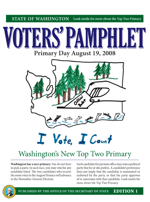
Q) Didn't the cover have children's artwork on it? Where'd that go?
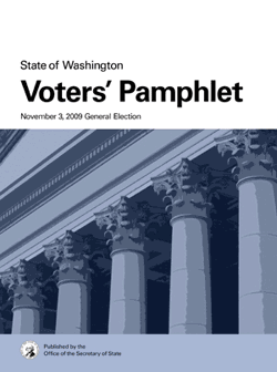
A) Years when a federal office was on the ballot the cover featured children’s artwork. The artwork will move to the inside of the pamphlet beginning in 2010. Moving forward, the cover will have a consistent layout and artistic style to provide an obvious visual connection from pamphlet to pamphlet and to give it a mature, professional, branded look to match what voting is all about.
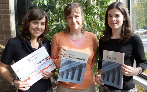
(Pictured from left, Jenny Greeve, Amanda Meyer, Lindsay Pryor)
Q) What are some advantages to the new Voter's Pamphlet over the old one?
A) The pamphlet is more usable. We established an information hierarchy – decided what information was most important – and then established an appropriate design hierarchy. Consistent layout of elements and treatment of information, removal of outdated graphic icons, and an increased type size for readers with low vision are some of the design principles incorporated into the redesigned pamphlet.
Q) How will the redesigned Voter’s Pamphlet impact the voting experience for Washingtonians?
A) Providing information clearly and consistently allows Washingtonians to quickly and easily access the information they need. Similar to how a brand can develop trust based on a consistent image, a well-designed pamphlet will inspire trust and voter confidence. It is the start of a larger effort to bring effective design for usability to voter registration materials, ballots, and voting centers.
(no html)
Secretary of State
Steve Hobbs
